To diagnose heart disease, visualization experts recommend a simpler approach
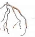
A team of computer scientists, physicists, and physicians at Harvard have developed a simple yet powerful method of visualizing human arteries that may result in more accurate diagnoses of atherosclerosis and heart disease. The prototype tool, called "HemoVis," creates a 2D diagram of arteries that performs better than the traditional 3D, rainbow-colored model. In a clinical setting, the tool has been shown to increase diagnostic accuracy from 39% to 91%.
Presented October 27 at the IEEE Information Visualization Conference(InfoVis 2011), the new visualization methodoffers insight to clinicians, imaging specialists, engineers, and others in a wide range of fields who need to explore and evaluate complex, branching structures.
"Our goal was to design a visual representation of the data that was as accurate and efficient for patient diagnosis as possible," says lead author Michelle Borkin, a doctoral candidate at the Harvard School of Engineering and Applied Sciences (SEAS). "What we found is that the prettiest, most popular visualization is not always the most effective."
HemoVis takes data from patient-specific blood flow simulations, combined with traditional imaging data, and visually displays a tree diagram of the arteries with areas of disease highlighted to assist in diagnosis.
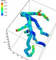
Tools for artery visualization in both clinical and research settings commonly use 3D models that portray the shape and spatial arrangement of vessels of interest. These complex tools require users to rotate the models to get a complete perspective of spatial orientation.
By contrast, the new visualization requires no such rotation or interaction. The tool utilizes 2D, circumference-adjusted cylindrical cross sections arranged in tree diagrams.
Though this visualization method may seem less high-tech, the team demonstrated through quantitative evaluation with medical experts that the 2D model is actually more accurate and efficient for patient diagnosis.
"In the 3D case, the more complex and branched the arteries were, the longer it took to complete the patient diagnosis, and the lower the accuracy was," Borkin reflects. "In the 2D representation, it didn't matter how many branches we had or how complex they were -- we got consistently fast, accurate results. We weren't expecting that."
Tree diagrams are hardly new, as evolutionary biologists will attest, but scientists in many fields are using them to solve a range of very modern and complex problems. In fact, Borkin applied her own experience in astronomy and physics to transform the concept of visualization for SEAS' Multiscale Hemodynamics research group. In prior work, she had used a very similar type of tree diagram to determine the structure of nebulae in outer space.
"With the consultation and cooperation of clinicians, we were able to draw on fairly well known visualization techniques and principles from computer science to solve a practical clinical problem," says Hanspeter Pfister, Gordon McKay Professor of the Practice of Computer Science at SEAS.
Borkin, Pfister, and their colleagues relied on the input of physicians and others with clinical or laboratory imaging experience throughout the process. Through extensive surveys and interviews, they identified the most popular options for display, accurate layout, and coloring of these arterial projections.
However, Borkin drew on well supported research that is less well known outside the visualization community:
"For years, visualization, computer science, and psychology researchers have identified that color is critical for conveying the value of data, but that the rainbow coloring is not well-attuned to the human visual system."
Accordingly, HemoVis departs from the traditional practice of rainbow color-coding in favor of a graded single-color scheme (red to black) that can represent placement along a continuum.
In tests, diagnostic accuracy, as measured by the proportion of diseased areas identified, increased dramatically with the new color scheme.
Widespread adoption of visual representations like those in HemoVis could have the effect of not only optimizing tasks that are critical for doctors, but also changing long-entrenched mindsets and making scientists "think twice" about their assumptions in data visualization, Borkin says.
"This approach to visualization design and validation is broadly applicable in medicine, engineering, and science," notes Pfister. "We hope that people will use this process as a template for transforming their own visualizations."
Borkin and Pfister acknowledged that while HemoVis represents an important step forward, traditional 3D artery models still play a role, particularly in providing a spatially intuitive tool for surgical planning.
With this in mind, the next steps for this research include further development and optimization of the 2D tool and investigation into how it might complement, rather than replace, its 3D counterpart.
A paper about this work will be published later this year in the journal IEEE Transactions on Visualization and Computer Graphics.
Source: Harvard University
Other sources
- A better view of heart diseasefrom Harvard ScienceSat, 29 Oct 2011, 16:10:15 UTC
- To diagnose heart disease, visualization experts recommend a simpler approachfrom Science DailyThu, 27 Oct 2011, 23:30:33 UTC
- To diagnose heart disease, visualization experts recommend a simpler approachfrom PhysorgThu, 27 Oct 2011, 20:01:09 UTC


